Exhibit Design Search | Smarter Trade Shows / Trade Show and Event Tips / Design, Lighting, and Graphics Tips /
7 Common Graphic Design Errors (Q&A)
Time to Make What's Wrong Right
 Question: Our graphics need a complete overhaul, as they're an ineffective, jumbled mess. However, I'm not 100-percent certain exactly where they went wrong. So how do I create new exhibit graphics without making the same mistakes again?
Answer: Many exhibitors are in the same boat. They know their graphics aren't serving them well, yet they can't quite put their finger on where they've gone dreadfully wrong. To help ensure your next set of graphics don't end up looking like the first, here are some of the most common errors exhibitors make when it comes to graphic design and production.
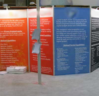
1. Creating an Oversized Brochure. The single biggest exhibit-graphic mistake is trying to turn a pamphlet into a graphic panel. Far too often exhibitors take a perfectly good image and cover it with paragraphs of text. However, attendees don't stop to read text-heavy graphics; in fact, this type of visual clutter often prevents them from stopping at all.
Instead, graphics should communicate an idea, a message, or maybe a couple of key points in a clear, concise manner. So if you must provide details, do so in your printed or electronic collateral, and ensure that all graphic content can be digested in 10 seconds or less. In short, what’s the problem you solve and what makes your solution unique.
2. Stretching Resolution. Many exhibitors try to "make do" with low-cost, low-resolution images, and they end up paying for it later with washed out or blurry images. Spending a little extra to secure high-resolution stock images or professional photography will make a huge difference in graphic quality.
 3. Failing to Factor in Exhibit Components. Typically exhibitors view and approve graphic files as individual elements. Instead, always ask designers to render your graphics into an electronic version of the entire exhibit display. This way, you'll have a much better understanding of whether their size and positioning will make the impression you intended.
For example, exhibit components, shelves, monitors, etc. can block or partially obstruct the view of key graphics. Or perhaps that 8-foot panel you created is getting lost in your 50-by-50-foot exhibit. Seeing the graphics rendered into the design will not only prevent obstructions but will also give you a much better idea of the impact your graphics will have in the space.
4. Designing in a Vacuum. Like a clothing line at New York Fashion Week, your exhibit graphics should have a cohesive story, as opposed to functioning as independent elements without connection. For example, you might have four product-centric panels at the ground level, two large billboard graphics above your exhibit, and maybe eight kiosk-based panels. While they may serve different purposes, they must all communicate in a similar fashion and have something to visually and mentally link them together. This connection could be created via images, colors, messaging, positioning, scale, etc. But without some kind of connection, your graphics will fail to work together and will instead confuse your message — and the attendees.
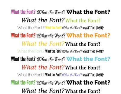
5. Indulging a Font Fetish. One or two fonts are plenty. I promise. Any more than that, and you've got an identity crisis on your hands. That's because legibility is key with any graphic design, but it's especially critical with graphics viewed from a distance. As such you want to use familiar, highly legible fonts to create a clean, consistent look across all graphics, which will ultimately enable attendees to quickly and effectively consume your messages. And as a general rule opt for common fonts, such as Helvetica or Garamond, and avoid superfluous fonts with names like Peace Mustache and Sweet Cheeks. (Yes, these actually exist.)
 6. Thinking Small. Once in a while you need a graphic to accompany a kiosk or a tiny product display. But more often than not, the purpose of your graphics is to lure in attendees and communicate a single message about your company, products, or brand. As such, you're better off with a handful of large, impressive graphics than shipping crates full of small graphics meant to be view from 2 feet away.
If you need to communicate at the 2-foot distance, simple poster board, iPad imagery, or even printed literature usually provide a better bang for your buck. And remember, anything positioned at eye level or below will likely be fully or partially blocked by attendees in the aisle or your exhibit. Thus, the higher and larger your graphics, the more chance they have of being seen in their entirety.
7. Forgoing Professionals. You can destroy your exhibit's aesthetic quality in a heartbeat if you fill you space with lackluster, unprofessional graphics. So always hire a professional graphic designer with experience in trade show work. He or she should know how to obtain quality files, format them, design your graphics, and hit your deadlines with ease. If you don't know how to create raster versus vector files, you can't expound upon the nuances of continuous tone, and you think a graphic bleed sounds like a bloody mess, you role in the graphic-design process should merely be to approve or disapprove of finished, professional designs.
While these missteps are just the tip of the iceberg, they're among the most common mistakes exhibitors make when it comes to graphic design and production. By simply avoiding these pitfalls, you'll be well on your way to creating an effective and eye-catching graphic system for your next exhibit.
For more information about trade show or event marketing, give us a call or Contact Us. We welcome the opportunity to assist you with your next event.
Mel White, CEI